search element with form functionality — Last Updated 1 December 2021details elementSupport in all current engines.
summary element followed by flow content.open — Whether the details are visibleHTMLDetailsElement.The details element represents a disclosure widget from which the
user can obtain additional information or controls.
The details element is not appropriate for footnotes. Please see the section on footnotes for details on how to mark up footnotes.
The summary element child of the element, if any,
represents the summary or legend of the details.
The rest of the element's contents represents the additional information or controls.
The open content
attribute is a boolean attribute. If present, it indicates that both the summary and
the additional information is to be shown to the user. If the attribute is absent, only the
summary is to be shown.
The ancestor details revealing algorithm is to run the following steps on currentNode:
While currentNode has a parent node within the flat tree:
The following example shows the details element being used to hide technical
details in a progress report.
< section class = "progress window" >
< h1 > Copying "Really Achieving Your Childhood Dreams"</ h1 >
< details >
< summary > Copying... < progress max = "375505392" value = "97543282" ></ progress > 25%</ summary >
< dl >
< dt > Transfer rate:</ dt > < dd > 452KB/s</ dd >
< dt > Local filename:</ dt > < dd > /home/rpausch/raycd.m4v</ dd >
< dt > Remote filename:</ dt > < dd > /var/www/lectures/raycd.m4v</ dd >
< dt > Duration:</ dt > < dd > 01:16:27</ dd >
< dt > Color profile:</ dt > < dd > SD (6-1-6)</ dd >
< dt > Dimensions:</ dt > < dd > 320×240</ dd >
</ dl >
</ details >
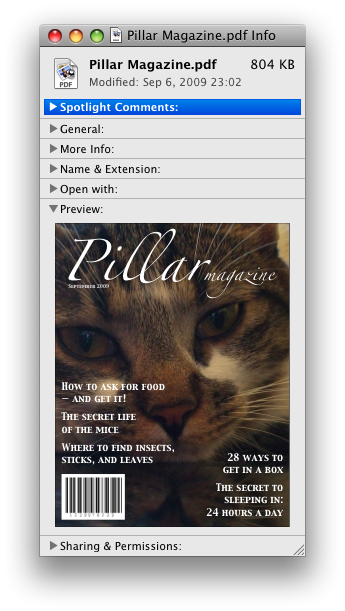
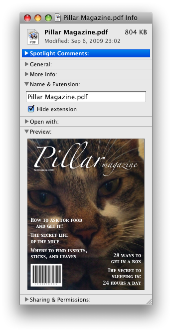
</ section > The following shows how a details element can be used to hide some controls by
default:
< details >
< summary >< label for = fn > Name & Extension:</ label ></ summary >
< p >< input type = text id = fn name = fn value = "Pillar Magazine.pdf" >
< p >< label >< input type = checkbox name = ext checked > Hide extension</ label >
</ details > One could use this in conjunction with other details in a list to allow the user
to collapse a set of fields down to a small set of headings, with the ability to open each
one.


In these examples, the summary really just summarizes what the controls can change, and not the actual values, which is less than ideal.
Because the open attribute is added and removed
automatically as the user interacts with the control, it can be used in CSS to style the element
differently based on its state. Here, a style sheet is used to animate the color of the summary
when the element is opened or closed:
< style >
details > summary { transition : color 1 s ; color : black ; }
details [ open ] > summary { color : red ; }
</ style >
< details >
< summary > Automated Status: Operational</ summary >
< p > Velocity: 12m/s</ p >
< p > Direction: North</ p >
</ details > summary elementSupport in all current engines.
details element.HTMLElement.The summary element represents a summary, caption, or legend for the
rest of the contents of the summary element's parent details
element.
A command is the abstraction behind menu items, buttons, and links. Once a command is defined, other parts of the interface can refer to the same command, allowing many access points to a single feature to share facets such as the Disabled State.
Commands are defined to have the following facets:
User agents may expose the commands that match the following criteria:
User agents are encouraged to do this especially for commands that have Access Keys, as a way to advertise those keys to the user.
For example, such commands could be listed in the user agent's menu bar.
dialog elementopen — Whether the dialog box is showingHTMLDialogElement.The dialog element represents a part of an application that a user interacts with
to perform a task, for example a dialog box, inspector, or window.
The open attribute
is a boolean attribute. When specified, it indicates that the dialog
element is active and that the user can interact with it.
Removing the open attribute will usually hide the
dialog. However, doing so has a number of strange additional consequences:
The close event will not be fired.
The close() method, and any user-agent provided cancelation interface, will no longer be able
to close the dialog.
If the dialog was shown using its showModal()
method, the Document will still be blocked.
For these reasons, it is generally better to never remove the open attribute manually. Instead, use the close() method to close the dialog, or the attribute to hide it.
The tabindex attribute must not be specified on
dialog elements.
dialog.show()Displays the dialog element.
dialog.showModal()Displays the dialog element and makes it the top-most modal dialog.
This method honors the autofocus attribute.
dialog.close([ result ])Closes the dialog element.
The argument, if provided, provides a return value.
dialog.returnValue [ = result ]Returns the dialog's return value.
Can be set, to update the return value.
This dialog box has some small print. The strong element is used to draw the
user's attention to the more important part.
< dialog >
< h1 > Add to Wallet</ h1 >
< p >< strong >< label for = amt > How many gold coins do you want to add to your wallet?</ label ></ strong ></ p >
< p >< input id = amt name = amt type = number min = 0 step = 0.01 value = 100 ></ p >
< p >< small > You add coins at your own risk.</ small ></ p >
< p >< label >< input name = round type = checkbox > Only add perfectly round coins</ label ></ p >
< p >< input type = button onclick = "submit()" value = "Add Coins" ></ p >
</ dialog >